Problem Statement
The existing ERP interface was functional but lacked visual clarity and ease of use. Financial and supply chain (along with Human Resource and Talent) users were reporting difficulties in accessing key features, leading to inefficiencies in daily operations such as transaction processing, inventory management, and financial reporting. The challenge was to design icons that would simplify these workflows and improve the overall user experience without compromising the complexity of the software.
Objectives
Streamline user interaction across financial and supply chain modules
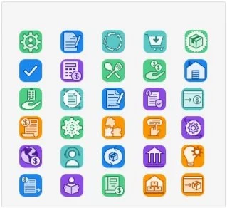
Create 30 visually engaging and functional icons that guide users through complex processes.
Ensure consistency with our overall ERP design system while catering to the unique needs of each department.
Improve task efficiency and data access by designing assets that prioritize user-friendly navigation.
The icons recommended by our design system left the teams with several concerns
Names of icons did not match the list of webapps
Number of icons did not match the number needed
Acronyms instead of images works only for English and increases the cognitive load on the user

Design Planning

We mapped out the icons that were requested, thoughts and style ideas to try out

We gathered source material for icon brainstorming.
Then we worked the icons to suit our needs by modifying the SVG's using Figma and Illustrator.
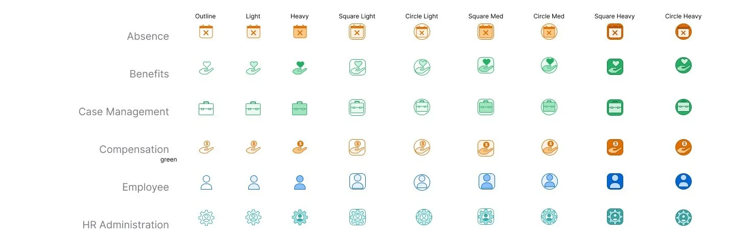
We styled versions to help guide discussion of the final look and feel including the following styles:
Outline
Light
Heavy
Square Light
Circle Light
Square Medium
Circle Medium
Square Heavy
Circle Heavy
Outcome
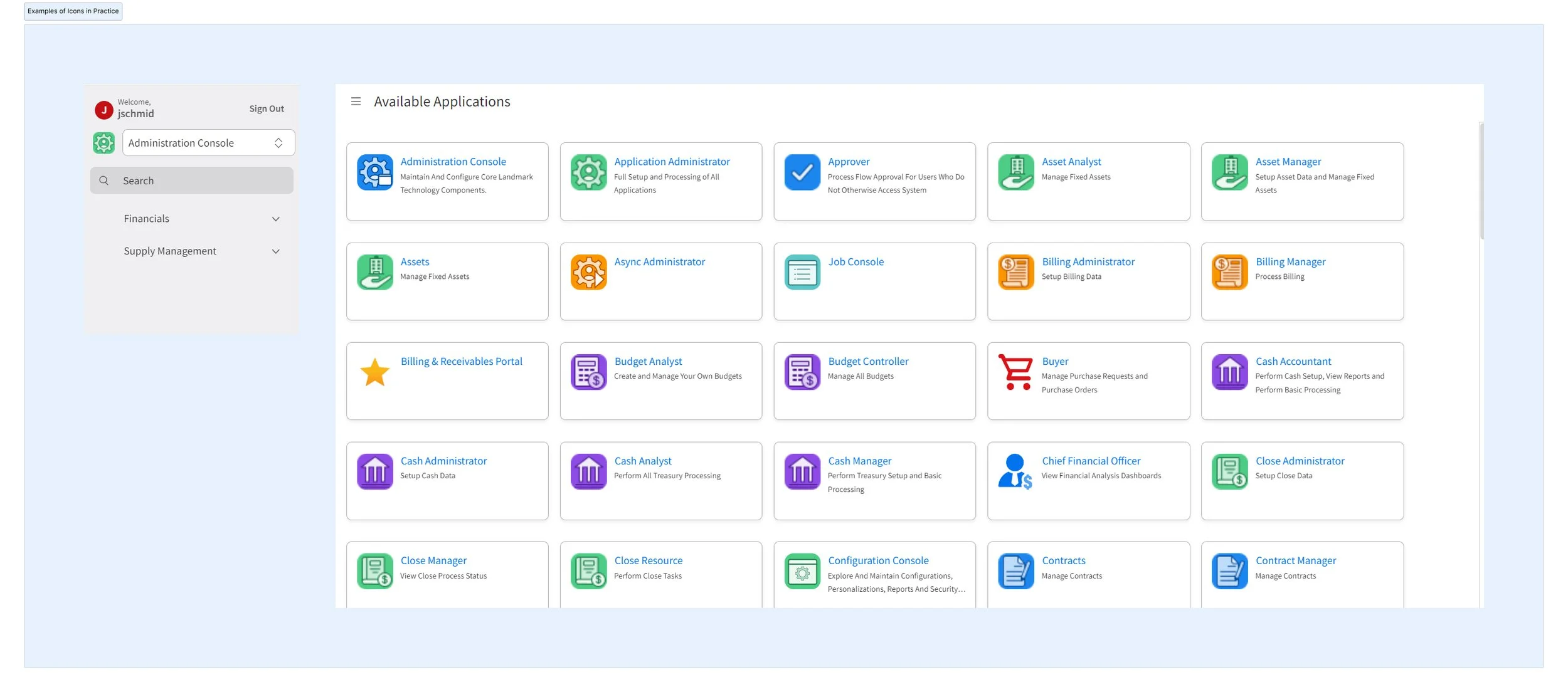
The final design delivered a more intuitive and visually appealing user interface that significantly improved the efficiency of financial and supply chain operations. A key focus was on enhancing the web application icons, creating more user-friendly and relatable iconography that streamlined interaction. Key improvements included:
Improved Visual Hierarchy: The use of distinct, recognizable icons allowed users to process transactions faster and with fewer errors. The improved iconography was integrated into the overall visual design, contributing to clearer differentiation between tasks.
Customizable Dashboards: Tailored views, combined with easily identifiable icons, empowered users to focus on the metrics that mattered most to them, leading to better decision-making and time savings.
Conclusion
This project reinforced the importance of designing with the user’s workflow in mind, especially in complex environments like financial and supply chain operations. By improving the web application icons and incorporating relatable iconography, we ensured that users could navigate the system more easily and efficiently. Combining clean, functional design with user insights allowed me to create assets that not only improved usability but also contributed to the overall success of the ERP system.
“After discussion as a team, it was determined that the borderless rounded square was the best style to use with the new icons
We reused assets from the IDS (Infor Design System) library wherever we could, to keep the style consistent with the rest of the product.”