
VS.
Case Study: Website Experience Redesign
Freelance UX Designer
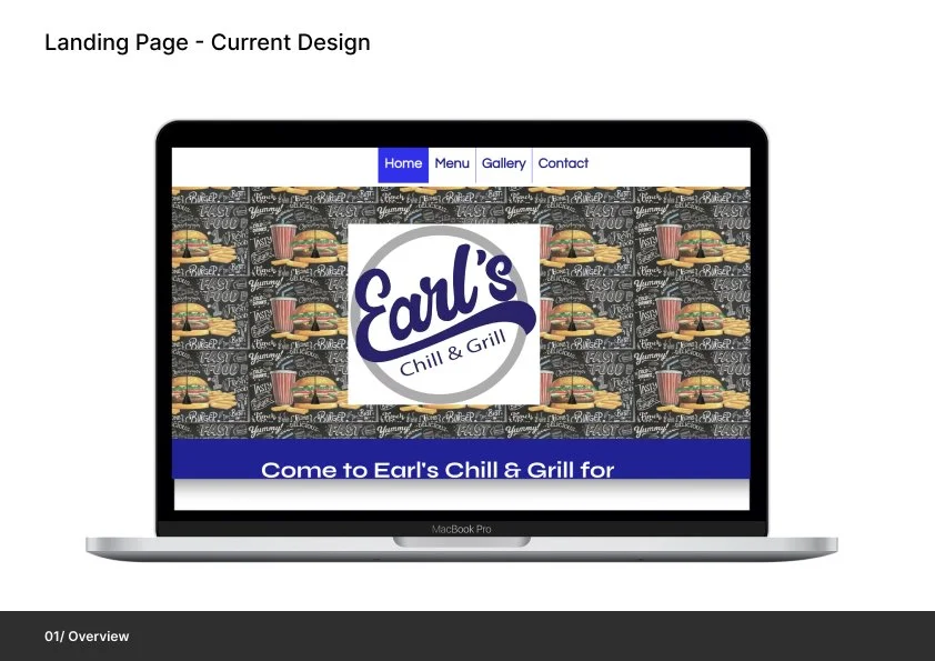
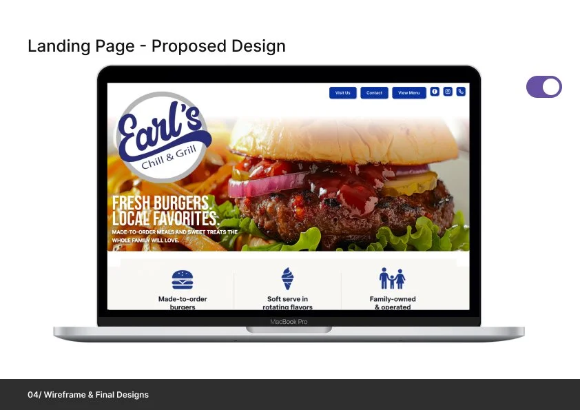
Earl’s Chill & Grill — Website Experience Redesign
Conducted a full UX audit of the existing website, uncovering usability issues related to navigation, content organization, and mobile experience.
Redesigned the information architecture to create a more intuitive browsing experience, making it easier for users to find menu items, access key information, and take action quickly.
Introduced strategic improvements including simplified menu categorization, clearer calls-to-action, and an enhanced location experience with a custom “Visit Us” section.
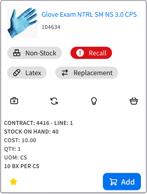
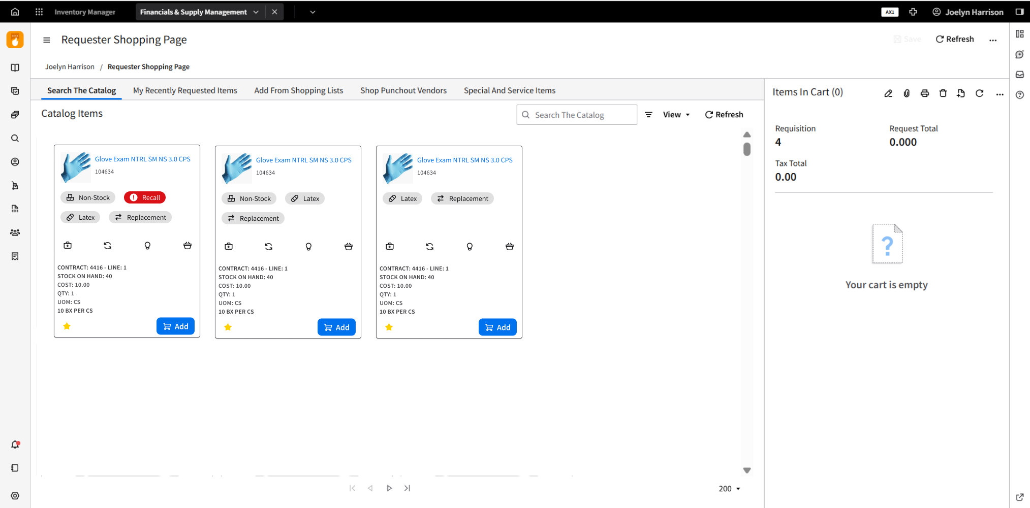
Case Study: Card Anatomy System for Requisition Item Selection
Completed while working as a UX Designer at Infor
Overview:
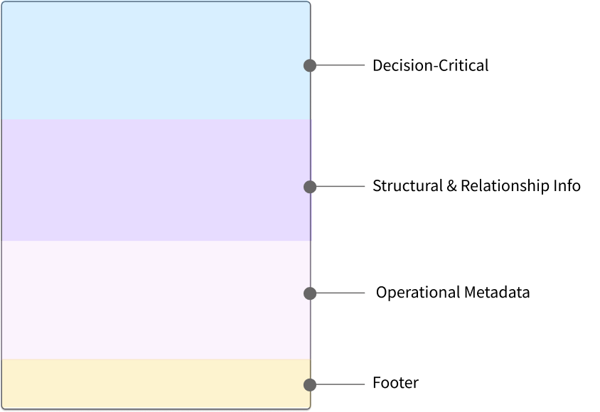
I designed a reusable card anatomy framework to clarify how information is prioritized and displayed when users add items to requisitions. The goal was to reduce cognitive load and decision errors by clearly separating decision-critical signals from contextual and operational details.
This case study demonstrates how a tiered information model—paired with explicit visual hierarchy rules—can scale across complex item states (e.g., recall, non-stock, kits, substitutes) while remaining scannable, accessible, and implementation-ready. The outcome is a shared system that helps design and development teams make consistent decisions without re-debating layout on every card.


EDI Workspace Dashboard
Completed while working as a UX Designer at Infor
Overview:
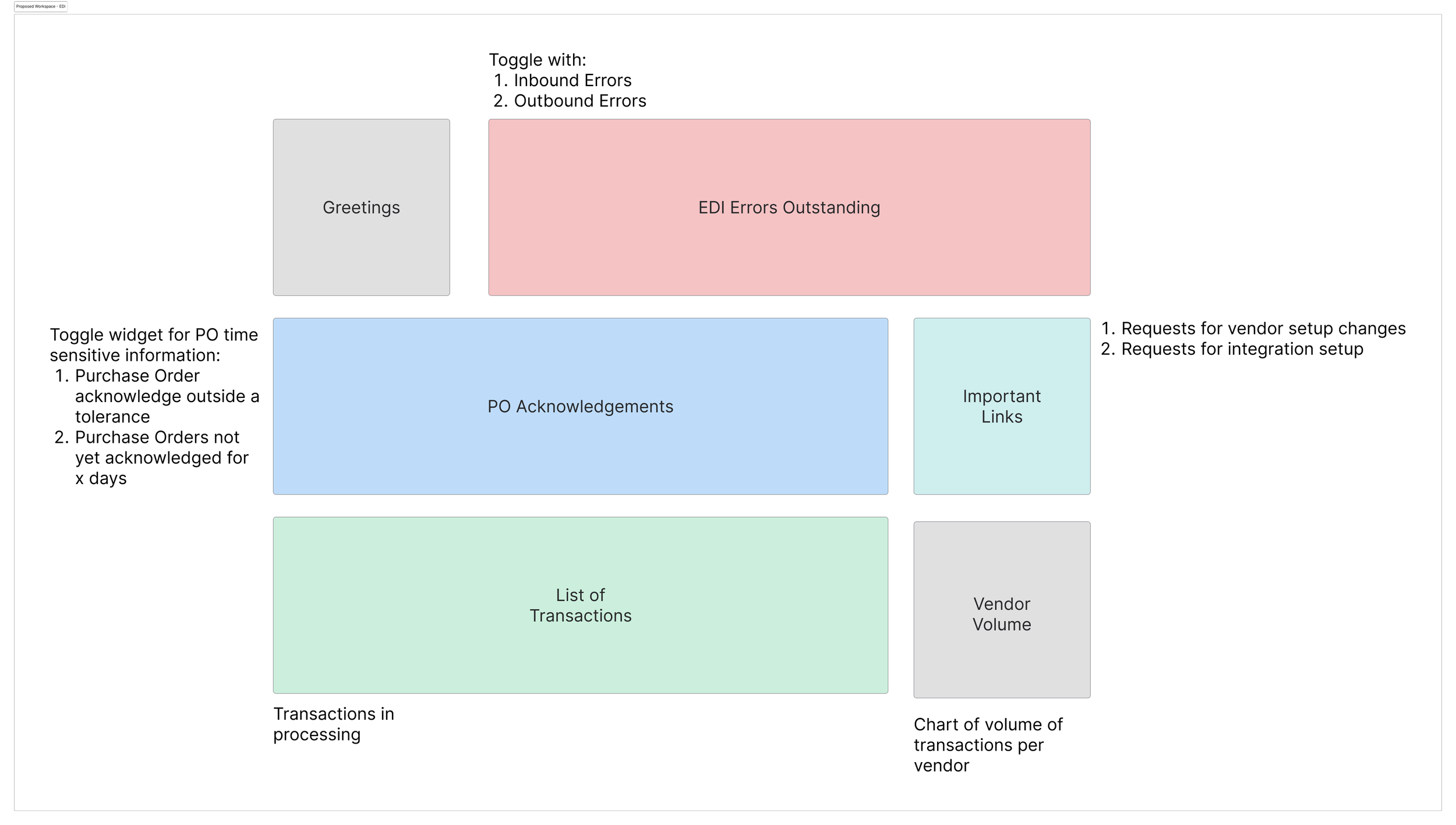
In an effort to streamline and improve the efficiency of supply chain purchases, I developed an EDI Administrative Workspace that enhances how electronic data is exchanged between our company and its suppliers. The goal was to accelerate the purchasing process by creating a workspace where EDI errors, transactions, and vendor volume data could be easily monitored and addressed, thus reducing the time spent manually processing and reviewing supplier files.

Web Application Icon Uplift
Completed while working as a UX Designer at Infor
Overview:
In my role as a UX designer, I was tasked with creating key design assets for the financial and supply chain modules of our ERP software. These assets were aimed at enhancing user interaction, improving efficiency, and making complex processes easier to navigate for users across the financial and supply chain sectors.
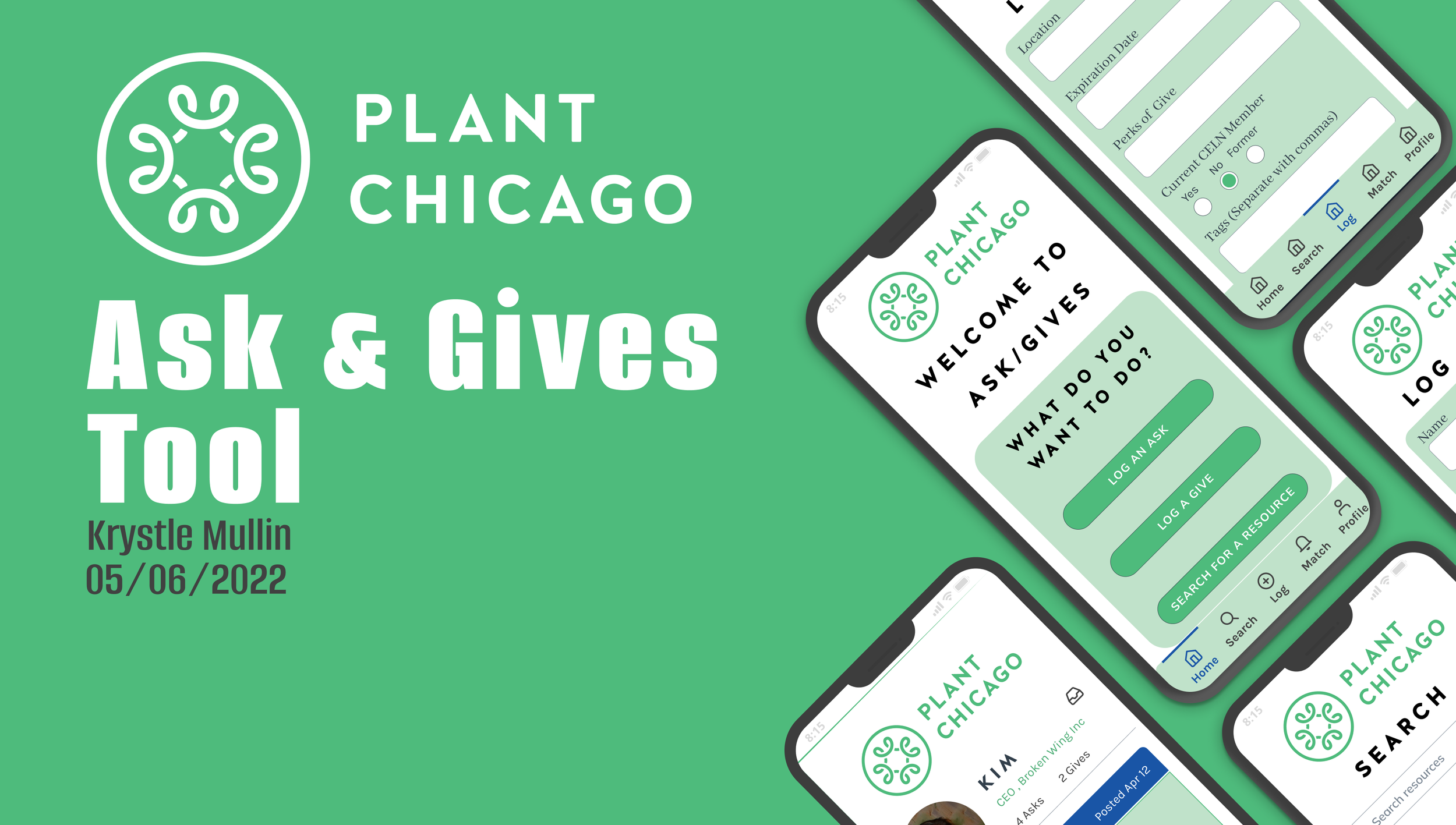
Asks & Gives Tool
Client: Plant Chicago
Project Brief: Create a way to facilitate the non-monetary exchange of materials and skills between business owners who participate in Plant Chicago’s Circular Economy Leaders Network (CELN).